Chapter 3: Probability, distribution, parameter estimates and likelihood
Author
Jakub Těšitel
Random variable and probability distribution
Imagine tossing a coin. Before you make a toss, you don’t know the result and you cannot affect the outcome. The set of future outcomes generated by such process is a random variable. Randomness does not mean, that you do not know anything about the possible outcomes of this process. You know the two possible outcomes that can be produced and the expectation of getting one or the other (assuming that the coin is “fair”).
A random variable can thus be described by its properties. This description of the process generating the random variable is then indicative of the expectations of individual future observations – probabilities.
We are not limited by a single observation but can consider a series of them. Then, it makes sense to ask, e.g. what is the probability of getting less than 40 eagles in 100 tosses? If we do not fix the value to 40 but instead study the probabilities for all possible values (here: What is the probability of getting less than 1, 2, 3, …, 100 eagles in 100 tosses?), we can define the probability associated with each value from 1 to 100 as: \[
p_i = P(X < x_i)
\] where \(p_i\) is the probability of observing a value \(X\) which is lower than \(x_i\). Then we can construct the probability distribution function defined as: \[
f(X) = \sum_{x_i < X}p_i
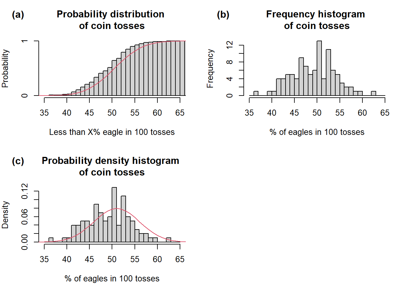
\] In human language, this translates as: Take probabilities \(p_i\) of all values \(x_i\) lower than \(X\), compute their sum and you get the value of probability distribution function for value \(X\) (Fig 1a). Let’s simulate it:
Show R Script
set.seed(42)# First, we need a randomly generated sample from binomial distribution# n = number of trials when eagle comes up (out of 100)# size = number of observations (each observation = 100 tosses)# prob = probability of eagle coming up in each tosscoin.r <-rbinom(n =0:100, size =100, prob =0.5)# Second, we need density function to plot theoretical probabilities on the plotcoin.d <-dbinom(0:100, size =100, prob =0.5)# Third, we also need distribution functioncoin.p <-pbinom(0:100, size =100, prob =0.5)# This is needed for plotting cummulative histogramh <-hist(coin.r, breaks =c(0:100), plot = F)h$counts <-cumsum(h$counts)/sum(h$counts)# Plotspar(mfrow =c(2,2), mar =c(5, 4, 4, 2))plot(h,xlim =range(35, 65),freq = T,main ='Probability distribution \nof coin tosses',ylab ='Probability',xlab ='Less than X% eagle in 100 tosses')lines(coin.p, col =2)mtext("(a)", side =3, adj =-0.2, line =2, font =2)hist(coin.r, breaks =c(35:65),xlab ='% of eagles in 100 tosses',main ='Frequency histogram \nof coin tosses')mtext("(b)", side =3, adj =-0.2, line =2, font =2)hist(coin.r, breaks =c(35:65),freq = F,xlab ='% of eagles in 100 tosses',ylab ='Density',main ='Probability density histogram \nof coin tosses')lines(coin.d, col =2, lwd =1)mtext("(c)", side =3, adj =-0.2, line =2, font =2)par(mfrow =c(1,1))
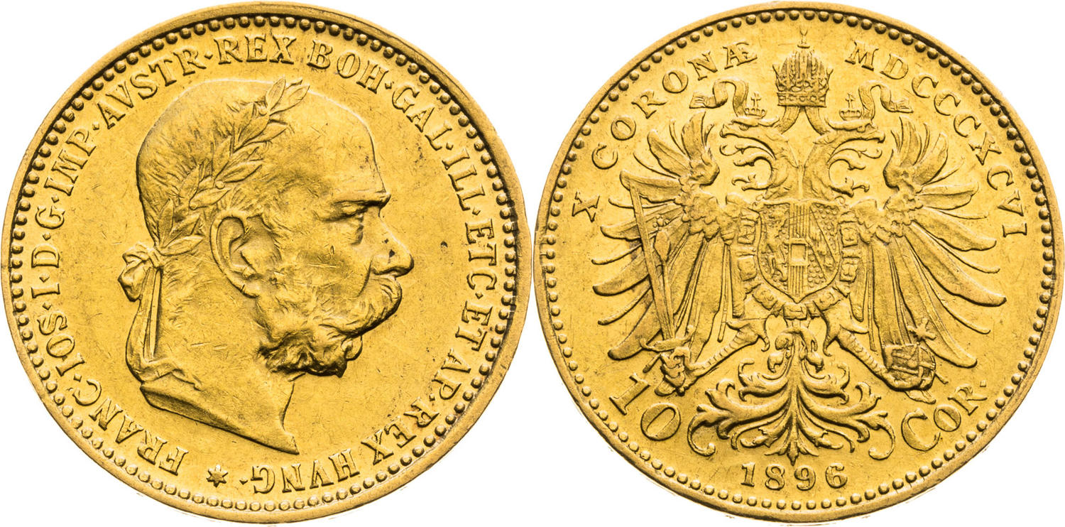
Probability (a), frequency (b) and density (d) distribution of coin tosses (n = 100, size = 100, p = 0.5). Grey histograms represent sampling statistics (prob., freq., dens.). The red lines in (a) and (c) represent theoretical binomial probability distribution and density, respectively. (d) standard 10 crown coin of the Austrian-Hungarian Empire used for tossing. Depicted here to illustrate why we call the coin sides the Head and Eagle instead of Brno and Lion as on the current 10 CZK coin.
Another option to explore the distribution of values is to sample a random variable and examine the properties of such a sample. After you take such a sample (or make a measurement), i.e. record events generated by a random variable, corresponding values cease to be a random variable but become the data. The data values may be plotted on a histogram of frequencies (Fig 1b, see also Chapter 2).
The frequency histogram can be converted to a probability density histogram (Fig 1c) by scaling the area of the histogram to a 0-1 range. The density diagram has a great advantage in that probabilities of observing a value within a given interval can directly be read as the size of the area of a given column. The histograms shown in Fig 1c indicate sampling probability distribution or density based on the data.
By contrast, the red lines (Fig 1a and 1c) indicate theoretical probability distribution or density, i.e. how the values should look if they followed the theoretical binomial distribution, which describes the coin-tossing process. As you can see, the sampling and theoretical distributions do not match exactly, but there does not seem to be any systematic bias. The density of theoretical probabilities can thus be viewed as an idealized density histogram.
NoteHead and Eagle
Ten corona coin of the Austrian-Hungarian Empire illustrates why we call the coin sides the Head and Eagle.
There are many types of theoretical distributions, which describe many different processes generating random variables. Each of these types can further have many shapes, which depend on the parameters of the probability distribution function. E.g. the shape of the binomial distribution, which describes our coin tossing problem, is defined by parameters \(p\) indicating the average probability of observing one outcome and \(size\), which is the number of trials (tosses in our case).
Coin tossing produced discrete values to which probabilities could directly be assigned because there is a limited number of possible outcomes. This is not possible with continuous variables, as the number of possible values is infinite. However, if you look back at the definition of the probability distribution function, this is not a problem because, for any value, you can find an interval of lower values.
Normal distribution
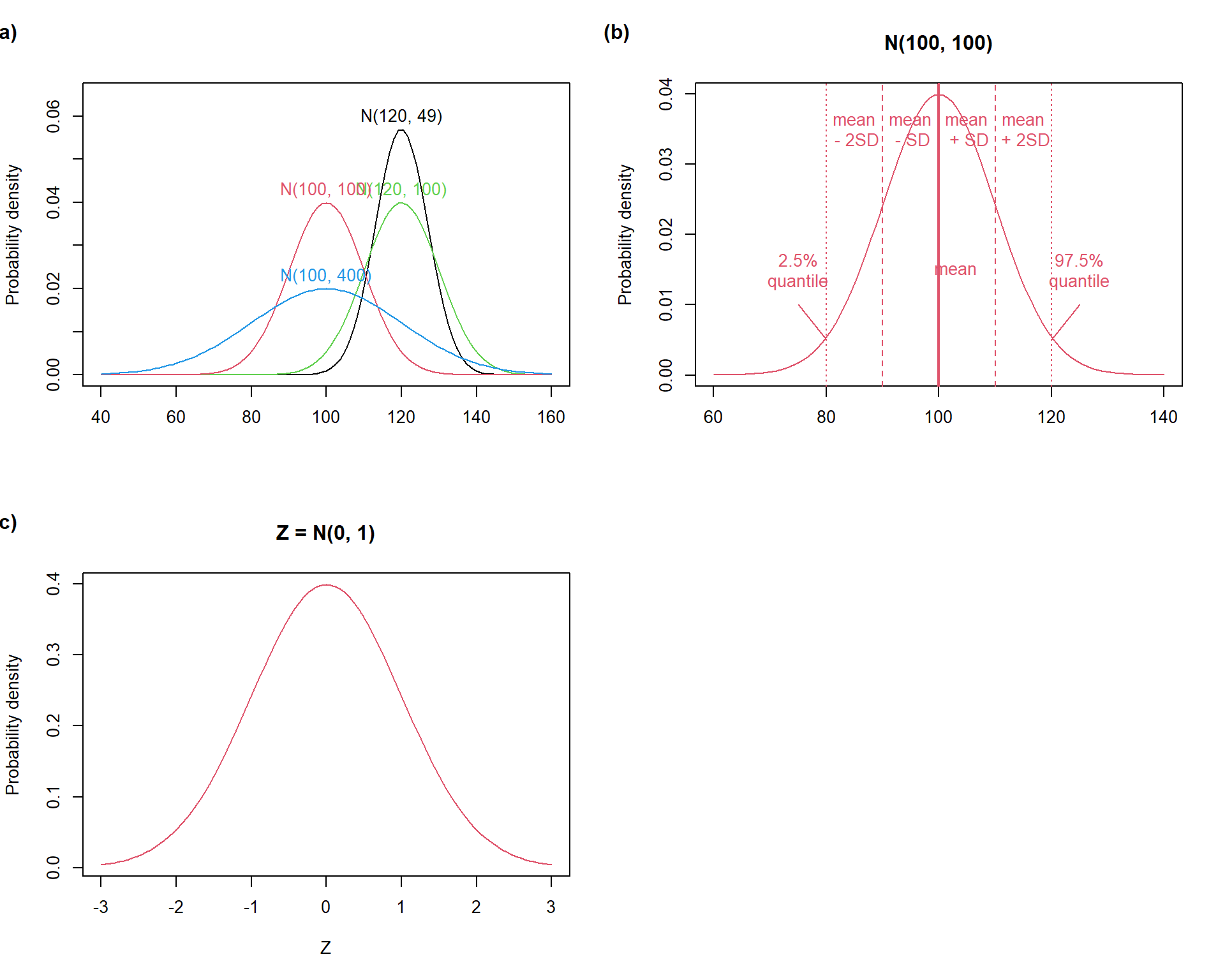
So far, our example utilized binomial distribution. Among many theoretical distribution types, we will focus on normal (Gaussian) distribution. This distribution describes a process producing values symmetrically distributed around the center of the distribution. Normal distribution can be used to describe (or approximate) distribution of variables measured on ratio and interval scale. It has two parameters, which define its shape:
the central tendency (expected value) called mean - i.e., sum of all values divided by the number of objects: \[
\mu = \frac{\sum_{i = 1}^{N}X_i}{N}
\]
the variance which defines the spread of the probability density - i.e., mean square of differences of individual values from the mean (how far from the centre do the values usually fall): \[
\sigma^2 = \frac{\sum_{i = 1}^{N}(X_i - \mu)^2}{N}
\] Variance is given in squared units of the variable itself (e.g. in m2 for length). Therefore, standard deviation (\(\sigma\), SD), which is simply the square root of the variance, is frequently used: \[
\sigma = \sqrt{\sigma^2}
\] The common notation of the normal distribution with mean \(μ\) and variance \(σ^2\) is \(N(μ, σ^2)\).
Normal distribution has non-zero probability density over the entire scale of real numbers. This implies that normal distribution may not always be a suitable proxy distribution of some variables, e.g. physical variables such as length or masses, because these cannot be lower than zero. However, normal density becomes close to zero if one moves several standard deviations (SD units) away from the mean (Fig. 3.2b). This means that normal distribution may be used for the always-positive variables (like length, mass etc.) only if the mean is reasonably far from zero (measured by SD units). At the same time, this implies that the existence of outlying values is not expected and normal approximation of variables containing them may be problematic.
Show R Script
par(mfrow =c(2,2)) # Set grid# (a)curve(dnorm(x, mean =120, sd =sqrt(49)), # Generate curve for Normal distribution with mean = 120 and sd = sqrt(49)from =40, to =160, # Set x axis rangeylim =range(0, 0.065), # set y axis rangeylab ='Probability density', # y lab namexlab ='') # x lab without nametext(x =120, y =0.06, labels ='N(120, 49)') # add annotation to the curvecurve(dnorm(x, mean =120, sd =sqrt(100)), col =3, add = T) # similarly for different means and sdstext(x =120, y =0.043, labels ='N(120, 100)', col =3)curve(dnorm(x, mean =100, sd =sqrt(100)), col =2, add = T)text(x =100, y =0.043, labels ='N(100, 100)', col =2)curve(dnorm(x, mean =100, sd =sqrt(400)), col =4, add = T)text(x =100, y =0.023, labels ='N(100, 400)', col =4)mtext("(a)", side =3, adj =-0.2, line =2, font =2) # label plot# (b)curve(dnorm(x, mean =100, sd =sqrt(100)), # Generate curve for Normal distribution with mean 100 and sd 10 (sqrt(100))from =60, to =140,col =2,main ='N(100, 100)',ylab ='Probability density',xlab ='')abline(v =100, col =2, lwd =2) # add lines indicating quartilesabline(v =c(100-10, 100+10), col =2, lty =2)abline(v =c(100-20, 100+20), col =2, lty =3)text(x =c(85, 95, 103, 105, 115), # annotate linesy =c(0.035, 0.035, 0.015, 0.035, 0.035),labels =c('mean\n - 2SD', 'mean\n - SD', 'mean', 'mean\n + SD', 'mean\n + 2SD'),col =2)text(x =75, y =0.015, labels ='2.5%\nquantile', col =2)text(x =125, y =0.015, labels ='97.5%\nquantile', col =2)arrows(75, 0.01, 80, 0.005, length =0, col =2)arrows(125, 0.01, 120, 0.005, length =0, col =2)mtext("(b)", side =3, adj =-0.2, line =2, font =2) # label plot# (c)curve(dnorm(x, mean =0, sd =1), # Generate curve for standardised Normal distribution (Z)from =-3, to =3,col =2, lwd =1,main ='Z = N(0, 1)',ylab ='Probability density',xlab ='Z')mtext("(c)", side =3, adj =-0.2, line =2, font =2) # label plotpar(mfrow =c(1,1)) # Set grid back to normal view
Normal distribution properties: (a) varying parameters, (b) SD-unit intervals, and (c) the standard normal distribution.
Any normal distribution can be converted to the standard normal distribution (with mean = 0 and SD = 1) by subtracting the mean of the original normal distribution and dividing the values by SD. This procedure is called standardization.
The central limit theorem is an important statement relevant to the use of normal distribution. It states that in many situations when multiple independent random variables are added, their sum tends to converge to normal distribution even if the original variables were not normal. For instance, biomass production in grasslands is affected by many processes (e.g. water use by plants, photosynthesis, …) sum of which can often be reasonably approximated by the normal distribution.
Probability computation
Knowing the probability distribution of certain variables allows probabilities associated with given intervals of the variables to be computed. For instance, a producer of clothes may design T-shirt sizes to cover 95% of the population of customers if he knows that body size has a certain probability distribution, e.g. normal distribution described by mean and variance.
Two functions are used for the conversion between the values of the variable and probabilities. The probability distribution function computes probabilities of observing values lower (lower tail) or higher (upper tail) than a given threshold. The quantile function is inverse to the probability distribution function and allows computing the quantiles – the threshold values of the original variable associated with a given probability value.
Parameter estimates, statistical sampling and likelihood
Probability computation can be a very informative analysis but it requires prior knowledge of the theoretical distribution and its parameters. This is usually not the case. In most cases, we have just the data, i.e. the statistical sample. This sample can be imagined as a subset of the statistical population, i.e. possibly an infinite set of all values contained in the random variable.
It seems as a logical step to estimate the population parameters from those of the sample. Recall now the story of prisoners in the cave in Chapter 1. In parallel with them, we have information only on a fraction of reality (sample) from which we estimate how the reality (population) looks like.
Such a process of statistical inference is possible under certain conditions:
The type of the theoretical distribution of population values must be known or at least assumed (the latter is the case in reality). This cannot be derived from the data. However, it is possible to compare the sampling distribution of the data (illustrated e.g. by a histogram) and a theoretical distribution (e.g. Fig. 3.1c).
The data must be generated by random sampling from the population. If the sampling is not random, parameter estimates get biased.
Population parameters are assumed to be fixed (as opposed to random) in classical statistics (sometimes called frequentist statistics). This corresponds to the fact that there is only one true value of a single population parameter – no alternative truths are allowed.
We cannot assign any probabilities either to population parameters or to completed estimates because probabilities can only be assigned to future outcomes of a random variable. However, we can assign likelihood to the estimates.
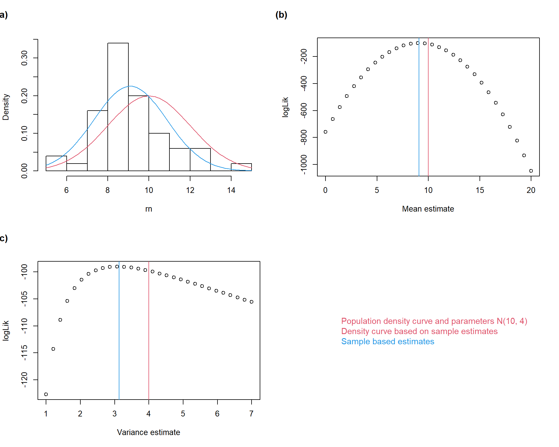
In continuous variables, the likelihood of a parameter value (given the observed data) is the product of probability densities corresponding to the observed values, which are derived from the density distribution function containing a given parameter estimate. For practical reasons, we use log-likelihoods where the product transforms into sum. Maximum likelihood estimation then involves searching for such parameters which have the highest log-likelihood values (Fig. 3.3).
Practically, the population parameters are estimated by computing estimators:
Maximum likelihood estimator of \(\mu\) is the arithmetic mean: \[
\bar{x} = \frac{\sum_{i = 1}^{n}{x_i}}{n}
\]
the uncertainty of the estimation of the population mean can be characterized by the error associated with \(\bar{x}\). This is called the standard error of the mean (SE, \(s_{\bar{x}}\)) \[
s_{\bar{x}} = \frac{s}{\sqrt{n}}
\]
Important
You can see, that the uncertainty about the population mean decreases with the square root of the number of observations. The more observations, the more precise the inference!
The maximum likelihood estimator of the population variance is sample variance: \[
s^2 = \frac{\sum_{i = 1}^n(x_i - \bar{x})^2}{n - 1}
\]
Important
Note the difference in the denominator between formulae of sample \((n - 1)\) and population variances (\(n\)).
The sample standard deviation is then: \[
s = \sqrt{s^2}
\]
Show R Script
# 1. Setup Parameters and Sampleset.seed(1234) # Optional: makes the "random" results reproducible# Population Parameterspop_mean <-10pop_var <-4n <-50rn <-rnorm(n, mean = pop_mean, sd =sqrt(pop_var)) # generate random sample# Calculate Sample Estimatessample_mean <-mean(rn)sample_var <-var(rn)# 2. Calculate Likelihood of various mean estimates (being the true mean)means <-seq(0, 20, length.out =30)loglik_m <-sapply(means, function(m) sum(dnorm(rn, mean = m, sd =sd(rn), log =TRUE)))# 3. Calculate Likelihood of various variance estimates (being the true variance)vars <-seq(1, 7, length.out =30)loglik_v <-sapply(vars, function(v) sum(dnorm(rn, mean =mean(rn), sd =sqrt(v), log =TRUE)))# 4. Plotspar(mfrow =c(2,2))# (a) Histogram and densitieshist(rn, probability = T, col ='white', main ='')curve(dnorm(x, mean = pop_mean, sd =sqrt(pop_var)), col =2, add = T)curve(dnorm(x, mean = sample_mean, sd =sqrt(sample_var)), col =4, add = T)mtext("(a)", side =3, adj =-0.2, line =2, font =2) # (b) Log-likelihood meanplot(means, loglik_m, xlab ="Mean estimate", ylab ="logLik")abline(v = pop_mean, col =2)abline(v = sample_mean, col =4)mtext("(b)", side =3, adj =-0.2, line =2, font =2) # (c) Likelihood varianceplot(vars, loglik_v, xlab ='Variance estimate', ylab ='logLik')abline(v = pop_var, col =2)abline(v = sample_var, col =4)mtext("(c)", side =3, adj =-0.2, line =2, font =2)# Custom Legendplot.new()legend("center", legend =c("Population density curve and parameters N(10, 4)","Density curve based on sample estimates","Sample based estimates"),text.col =c(2,2,4),bty ="n", cex =1.1)
Maximum likelihood estimation of normal distribution parameters. A sample (\(n =
50\)) was sampled from a normally distributed population with \(\mu = 10\) and \(\sigma = 4\). Maximum likelihood estimation was then performed on the sample aiming at reconstruction of the population parameters. The mean value was estimated \(\bar{x} = 9.09\) and variance $s^2 = 3.13. The corresponding probability density function was plotted onto the sampling density histogram (a). Log-likelihoods of a series of possible mean and variance values are plotted together with the estimated and the population parameters (b, c).
Show R Script
par(mfrow =c(1,1))
Important
Note that in the real-life statistical inference, the information on population parameters is not known.
I guess, you may now think I am completely crazy. It took no less than 6 pages to explain all the complicated principles of probability calculation, likelihood and parameter estimate to end up with the simple calculation of arithmetic mean and variance!
However, you will see that it was worth it. In the following classes, we will discuss other probability distributions which are less intuitive than normal. So, it may make sense to have the first look at what is rather intuitive and familiar.
It may also seem possible to rely on the simple calculation of mean and variance and not bother about the underlying principles. But then, you run into the risk of misusing these statistics, such as using the arithmetic mean to determine final grades at schools (school grades indeed do not follow the normal distribution and arithmetic mean is a very poor estimator of the central tendency of their distribution).
Note also that the principles of statistical inference (e.g. the distinction between sample and population) described here have very universal importance and represent the core of statistical theory.
NoteHow to do in R
Normal distribution probability: pnorm()
parameter q in this function refers to quantiles, i.e. the values of the original variable
parameter lower.tail with possible values T (the default) or F indicates whether probability of observing lower or higher value than a given threshold is to be computed, respectively
Normal distribution quantile function: qnorm()
parameter p in this function refers to probability(ies), i.e. the values of normal probability distribution function for which the corresponding quantiles (values of the original variable) should be computed
Function rnorm() can be used to generate a sample (series of values) of normal distribution.
Functions for parameter estimates
arithmetic mean: mean()
standard error of the mean: there is no dedicated function in the default packages. Function se() can be found in package sciplot. Alternatively, it is possible to create a custom function for this: se <- function(x) sd(x)/sqrt(length(x)
variance: var()
standard deviation: sd()
Exercises
Import the people data (used in the first practicals) in R again. Compute means, variances, and standard deviations of heights for all people and then for each group defined by the combination of eye color and sex. Compute standard errors of the means for all of the means computed.
#AI Try to solve this task both in R and using an LLM. Instruct the LLM to provide not only the solution but also the R code.
Imagine, you measure plant height in a field measurement. Population mean is 25.5 cm and standard deviation is 2.4. You take 10 measurements on randomly selected individuals. Simulate this process in R and report the values of sample mean with its standard error, sample variance and median.
What happens with the mean, its standard error and variance if you misplace the decimal point and multiply one of the sampled values by 10.
What happens with median?
How would the situation look like if the sample was 10 x larger (i.e., 100 measurements were taken)?
#AI Consult this task with an LLM. Pay attention to the answer in question b.
You toss a coin three times and get head in all cases. What is the likelihood that the coin is fair? If the coin is fair, what is the probability of getting eagle in the next toss.
Imagine that the mean life expectancy in Czech Republic is a normally distributed random variable with mean = 81 and SD = 9.
What is the probability of each citizen to achieve the age of 100?
What is the probability to die before 50?
#AI Try to solve this task both in R and using an LLM.
Assume that the time needed to reach the Brno train station by walking is a normally distributed random variable with mean = 40 and variance = 6. How long before the train departure, you must leave the campus to have 90% probability to catch the train?
#AI Try to solve this task with your brain and then consult an LLM. Ask the LLM for a graphical presentation and to generate the ggplot2 script. Paste the script into R and generate the figure in R.
Tasks for independent work:
Assume that height of students follows the normal distribution with mean = 179 cm and variance = 121.
You are a chair designer. For which height range you should design chairs to be suitable for 99% of students (and the remaining 1% was distributed symmetrically, i.e. the chairs were too small for 0.5% and too big for 0.5%.)?
You are a chair designer. For which height range you should design chairs not to be too small for 95% of students?
How many potential basket-ball players (height equal or higher than 200 cm) would you expect in a sample of 550 students?
What is the probability that a randomly selected student will be tall between 170 and 190 cm?